Interactive graphic of Dr Who episodes IMDB rating by actor playing the Doctor
Why learn R
There are a lot of reasons why you should learn R, and it is very prevalent in academia, bioinformatics (analysis of biological data), data analyst and data scientist roles
A lot of LSE courses that involved statistics or data primarily use R. This is because R is a excellent tool for:
- Statistics
- Data handling (i.e. cleaning and manipulating data)
- Visualisations, interactive graphics, applications, and dashboards
- Reporting (i.e. academic writing as well as building websites)
- Automation (such as automating an analysis)
R is an open-source tool, which means you do not need to buy a licence in order to use it, and is a popular programming language, as shown in the PYPL index from 2023

Easy to learn
A key advantage of R is that it is retentively easy to learn, especially in comparison with other programming languages used for data analysis like Python. A large part of this is due to R being designed to work with data, so it feels natural, and some of the excellent extensions that have been added to R over the years to make it more slick (great examples are the tidyverse and data.table packages).
Further, there are the vast amount of online resources in forms of tutorials, blogs, online courses, people sharing code/examples and help available through online discussion forums like stackoverflow and slack.
Some of the best available resources to learn R are:
R for Data Science book and the first edition is still great
R for Data Science slack channel has great community support
Codecademy R course
R bloggers collates blog posts about R. Some blogs I would recommend checking out are https://www.cedricscherer.com/, https://karaman.is/, https://djnavarro.net/, https://github.com/tashapiro/TidyTuesday, https://www.yan-holtz.com/blog.html, and https://albert-rapp.de/blog.html
For data visualisation ggplot2 is the go to tool, and the best way to learn it is to run through the ggplot2 book and using the R graph gallery
For getting some open source data to start your own projects I would recommend the tidy Tuesday initiative. All datasets are hosted in github.
Statquest is a YouTube channel that provides clear explanations of statistical methods, and how do do them in R.
Take this example of how to do a linear regression in R
Or this for a multiple linear regression in R
Modern stats with R book provides some useful examples
R tutor which provides short examples of lots of statistical tests.
R statistics tutorials which are longer tutorials on models like regression.
Some examples of R being awesome for Data visualisation


Fun side note
This webpage was built using R. If you are interested, come to the workshops and chat to one of the instructors about it!
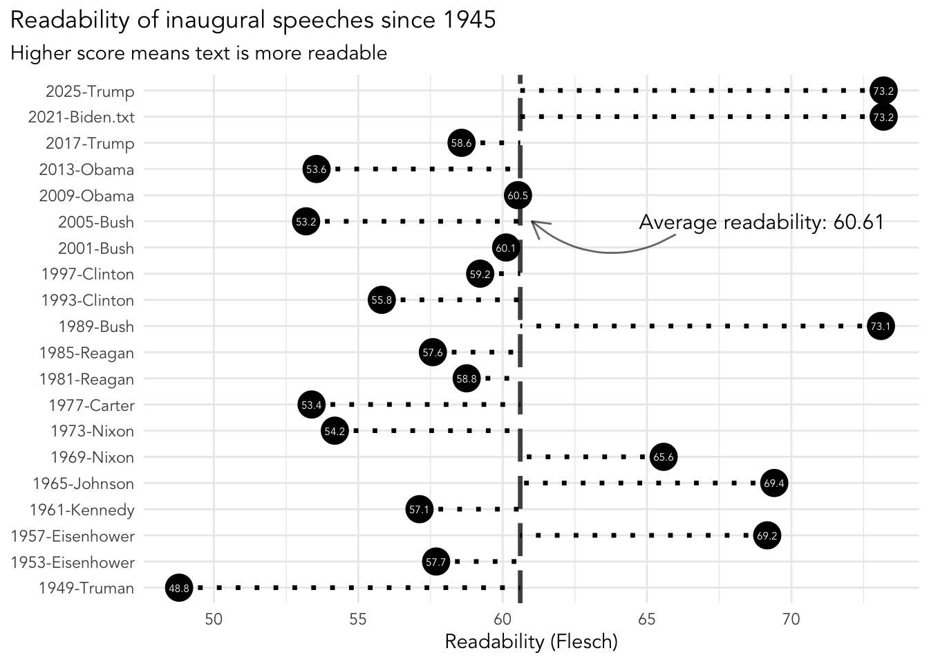
Below is an example of using the Quanteda package for text analysis, which is developed here at LSE by Ken Benoit. It is a visualisation to show how readable inaugural speeches from presidents have been since 1945. A higher score means the text used in the speech is more readable.
Show the code
# load libraries
library(quanteda)
library(quanteda.textstats)
library(ggplot2)

# prepare data
inaugural_readability <- data_corpus_inaugural %>%
    corpus_subset(Year > 1945) %>%
    textstat_readability(measure = c("Flesch"))

# calculate readability
avg_readability <- mean(inaugural_readability$Flesch)

# text and point colours
point_col <- "black"
text_col <- "white"

# make visual
ggplot(inaugural_readability,
       aes(x = document, y = Flesch)) +
  geom_point(size = 6.5, colour = point_col) +
  geom_hline(yintercept = avg_readability,
             alpha = 0.75, linetype = 5, linewidth = 1.2) +
  geom_segment(aes(xend = document, yend = avg_readability),
               linetype = 3, linewidth = 1.2) +
  geom_text(aes(label = round(Flesch, 1)),
            colour = text_col, size = 2, family = "Avenir") +
  annotate(geom = "text", x = "2005-Bush", y = 69,
           family = "Avenir", size = 4,
           label = paste0("Average readability: ", round(avg_readability,2))) +
  annotate(geom = "curve",x = 14.5, y = 66, alpha = 0.6,
           xend = "2005-Bush", yend = avg_readability+0.4,
           curvature = -0.35, arrow = arrow(length = unit(0.15, "inches"))) +
  coord_flip() +
    labs(x = NULL, y = "Readability (Flesch)",
         title = "Readability of inaugural speeches since 1945",
         subtitle = "Higher score means text is more readable") +
  theme_minimal(base_family = "Avenir") +
  theme(plot.title.position = "plot")