R 3: Exploring your data using visualisation
Learning Objectives
We will be following on from our previous project where we cleaned health report metrics data taken from various London boroughs for a research project. Now we want to explore the data using visualisation and summary statistics which will help us when we come to analyse the data.
Key takeaways:
Run and review summary statistics
Look at distributions of your data
Using counts and ranking to find out more from categorical data
Assessing correlations between numeric variables
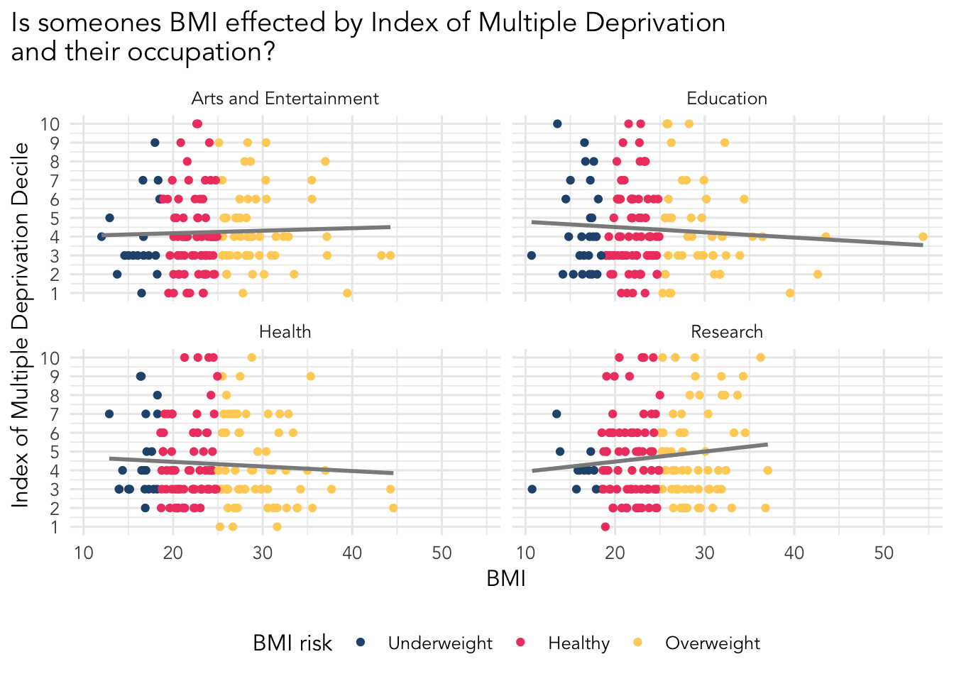
Throughout this worksheet you’ll be making several visualisations of your data. There is also a final project goal, which is to make the visualisation below.
You might be wondering why are we not just analysing the data straight away. Generally, the best practise is to spend some time reviewing your data so you know what you are dealing with. We do this by running some summary statistics, and visualising the data.
If you are interested here is an article about the importance of reviewing your data.
Setup
- Download the R script provided, which provides you with some structure. You can also use a R Markdown file if you prefer, which can be downloaded from the second button.
Move the downloaded file to your project folder we used in the data cleaning worksheet.
Open the R script or R markdown file in RStudio.
Install the
patchworkpackage which is used to combine multiple plots. See the package page for more information. We recommend installing packages using the console as you only need to install packages once.Load in the tidyverse and patchwork packages.
Load in health metrics dataset. You should already have it, but if you can’t find it we have provided a download of it below.
We recommend using the ggplot2 package for making visualisations. It is a great tool and simple to use. You will be loading it when you load the tidyverse set of packages.
Starting point, get some summary statistics!
We have two goals here, the first is to look at the summary statistics, the second is to get counts of categorical data in our dataset.
Use the summary() function on your data. Make note of the following using comments (if using a script) or in the non-code areas (if using R Markdown):
Any missing data?
Are the means similar to the median? If not it is a sign our data might not be normally distributed or have extreme values.
Do the minimum and maximum values make sense? For example, you shouldn’t be seeing anyone with an age of 150.
Use the table() function, which returns the number of times a given category is in your data, on your the categorical columns in your data. To use this function you use the dollar sign ($) to extract the column you want from your data such as: table(health$location).
Review the location, blood_pressure, bmi_risk, and whr_risk columns using table().
Again, make note of the following using comments (if using a script) or in the non-code areas (if using R Markdown):
Are we seeing similar proportions of each category you looked at?
Are any of the values particularly high or low? If so, do they seem to make sense to you?
Something to remember when looking the IMD deciles is that a score of 1 indicates high deprivation, and a score of 10 indicates low deprivation. Generally the research shows better health outcomes for those in areas of low deprivation (i.e. with a imd decile score between 8 to 10).
Distributions
Distributions are an essential way of looking at the spread of data, telling us how often a value occurs. This is helpful to see trends and if your data has a normal distribution.
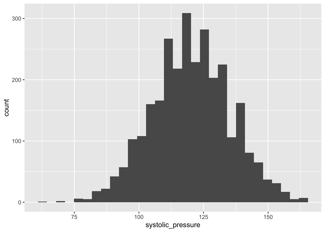
A classic visualisation for this task is the histogram, which shows a distribution of one variable.
Your goal here is to make at least 2 histograms on columns of your choice.
We suggest using the ggplot2 package. See some examples of building a histogram in the ggplot documentation or use the r graph gallery to help you make the figures.
You should end up with several visualisations looking like the image below.
Distributions between groups
Looking at one variable is great but to provide more information we sometimes need to look at a distribution that is broken down by a category.
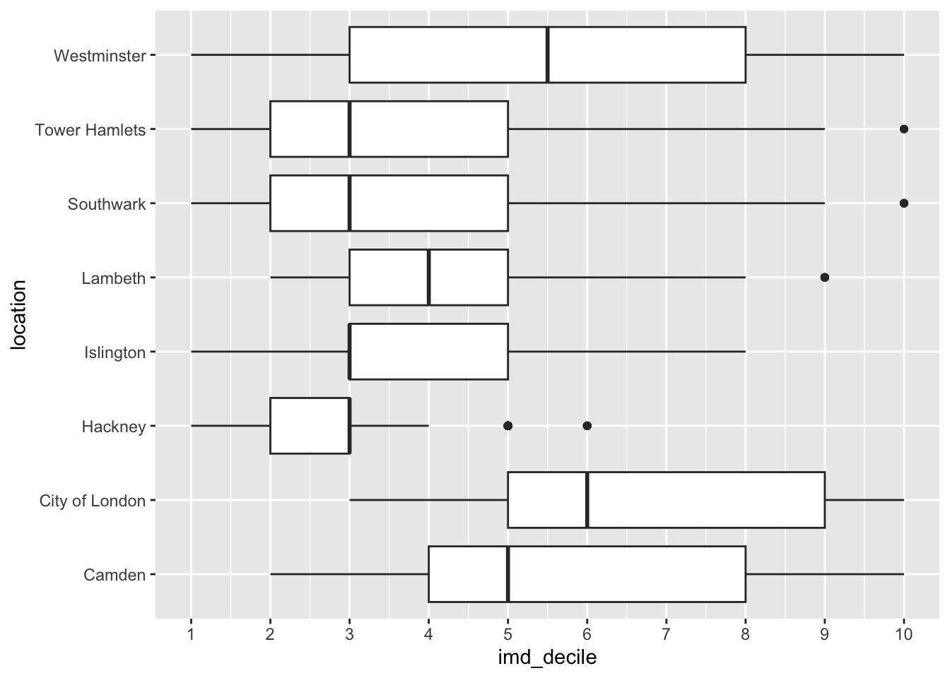
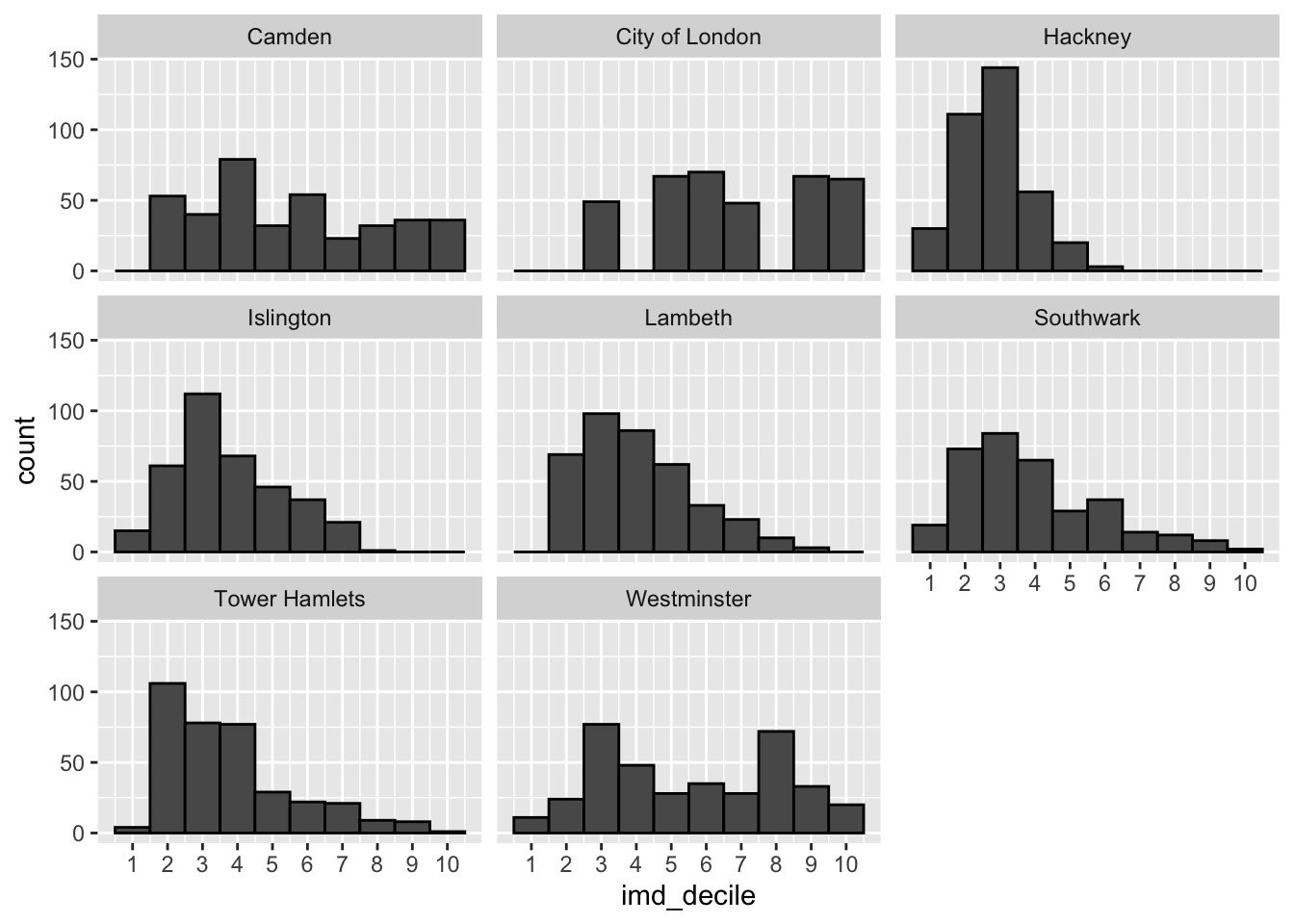
We can still use a histogram here, and there is also the box plot which is used to compare the distribution of several groups. See examples on how to build a box plot in the ggplot2 documentation or on the R graph gallery.
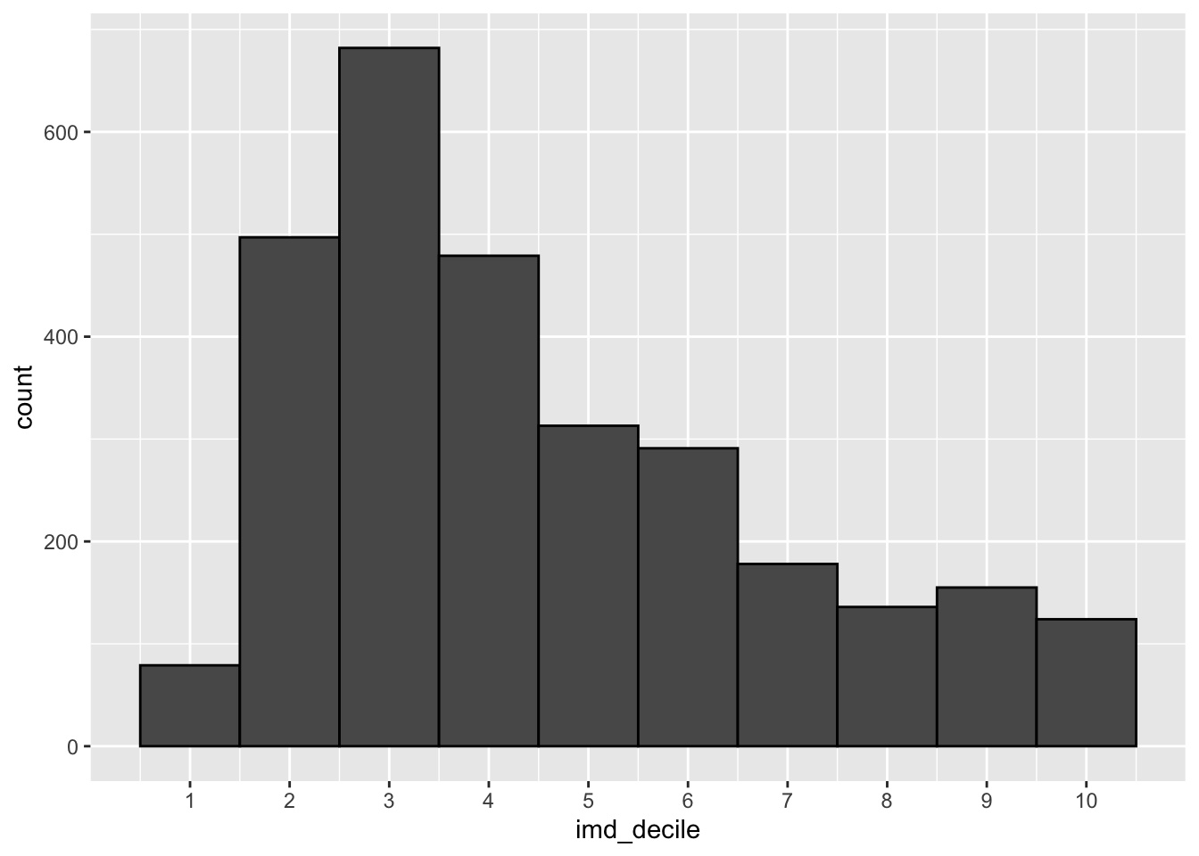
Your goal here is to create the three visualisations we have made below looking at the distribution of the imd_decile column.
What do you notice anything about the distributions? How does adding the location change how we see the data?
Looking at counts and ranking of categorical data
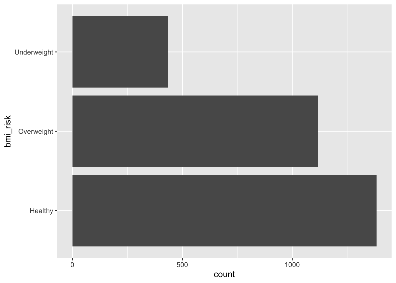
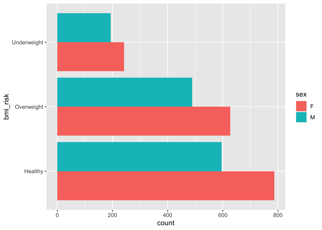
When we look at the counts or ranks of categorical data we are trying to see if there are differences between the groups. The classic way of doing this is using a bar plot. Essentially we are wanting to visualise the outcome we got from the table() function, or the aggregation we made in the last worksheet.
Your goal is to make two visualisations. One is a basic bar plot of the bmi_risk column. The second looks at the bmi_risk column against the sex column. You should end up with visuals that look like the outputs below.
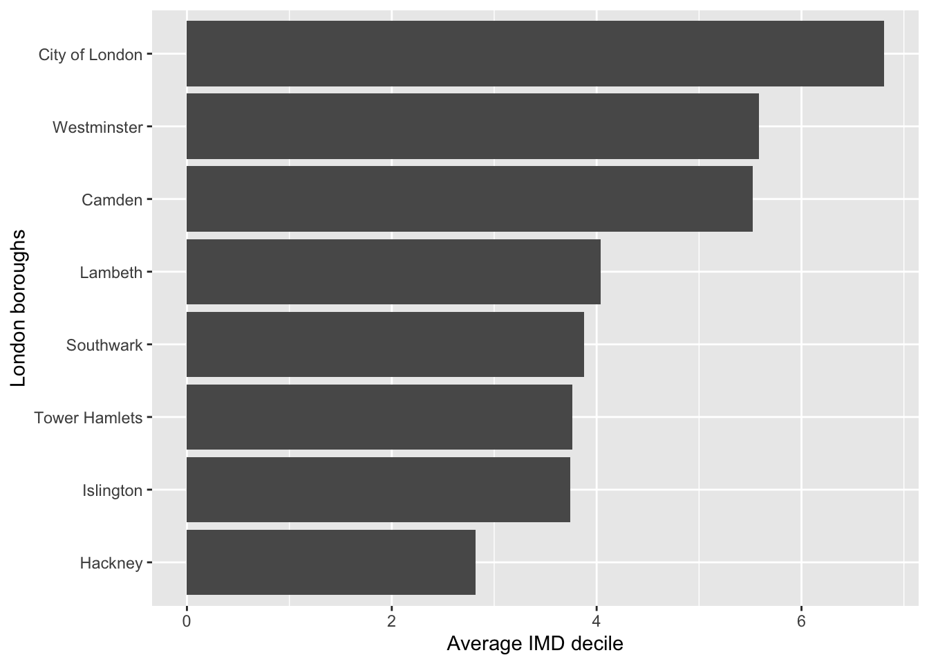
What about visualising average rankings?
We can also use bar plots to look at the average of a numeric variable per group. In the last worksheet we made some aggregates of our data, like this example below which is finding the average IMD decile per location.
health |>
  group_by(location) |>
  summarise(avg_imd_decile = mean(imd_decile, na.rm = TRUE))
# A tibble: 8 × 2
location avg_imd_decile
<chr> <dbl>
1 Camden 5.52
2 City of London 6.81
3 Hackney 2.82
4 Islington 3.75
5 Lambeth 4.04
6 Southwark 3.88
7 Tower Hamlets 3.76
8 Westminster 5.59Your goal is to, using the code above, make a visualisation that matches the visualisation below.
You can change the x and y labels in a plot by using the labs() function.
You might find the fct_reorder() function useful. You’ll find more information on the package webpage.
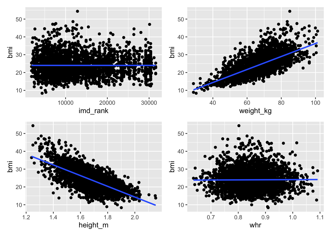
Relationships and correlations
When we do an analysis like regression we want to compare an independent variable to several dependent variables to test the relationship.
An important step in this process is to visualise the relationships between variables first, which helps you to decide what dependent variables to test or are worth testing.
There are two stages we recommend:
Stage 1: Build and visualise a correlation matrix
Stage 2: Make scatter plots of variables to look at the relationship
Your goal is to create a correlation matrix and series of scatter plots as shown below.
                    age         waist          hip     height_m     weight_kg
age         1.000000000  0.0055739960 -0.014264419  0.023891677  0.0016546088
waist       0.005573996  1.0000000000 -0.023210342  0.005754377  0.0007460346
hip        -0.014264419 -0.0232103419  1.000000000  0.026706406  0.0018960935
height_m    0.023891677  0.0057543772  0.026706406  1.000000000 -0.0046305054
weight_kg   0.001654609  0.0007460346  0.001896094 -0.004630505  1.0000000000
bmi        -0.013139411 -0.0037732059 -0.018091257 -0.697190606  0.6986542620
whr         0.012940250  0.7655675058 -0.657886092 -0.011425286 -0.0010333539
imd_rank    0.013644446  0.0024974921  0.035368269 -0.009618839 -0.0005106891
imd_decile  0.012280476  0.0047563457  0.035805790 -0.007006233  0.0006360997
                     bmi          whr      imd_rank    imd_decile
age        -0.0131394113  0.012940250  0.0136444459  0.0122804760
waist      -0.0037732059  0.765567506  0.0024974921  0.0047563457
hip        -0.0180912573 -0.657886092  0.0353682689  0.0358057905
height_m   -0.6971906060 -0.011425286 -0.0096188389 -0.0070062325
weight_kg   0.6986542620 -0.001033354 -0.0005106891  0.0006360997
bmi         1.0000000000  0.007238311 -0.0007951215 -0.0019110720
whr         0.0072383112  1.000000000 -0.0196376777 -0.0181302253
imd_rank   -0.0007951215 -0.019637678  1.0000000000  0.9928366644
imd_decile -0.0019110720 -0.018130225 0.9928366644 1.0000000000The correlation function, cor(), will require you to remove missing values from the dataset. We would strongly recommend when removing missing data to create a subset rather than removing the values from the dataset; put simply assign the result to a new dataset. The na.omit() function will help you remove the values.
The correlation function only works on numeric data. You will need to select the columns you need.
The ggplot documentation on the geom_smooth() function should help you out to add the regression line. We have used the lm method.
We used the patchwork package to combine the images.
Final (hopefully fun!) goal - build a cool visualisation
R is really good at data visualisation and is widely used by various companies and careers for this; data journalism is a good example where R is used a lot by the Financial Times, Economist, and the BBC to make their visuals.
Your goal is to make this visualisation. We are going to provide some code to guide you. You will have to write the rest of the code!
There are several steps:
Fixing the occupation column. There is some really nasty data here, check out the data to see what we mean.
Filtering our data to pick out only the occupations we are interested in.
Building the visualisation and faceting by the occupations we selected.
Below is the code for you to use and fix. Anywhere there is a ... it indicates something you need to add information to such as a dataset or a column name.
# fixing the occupation column by removing parts of a string
... <- ... |>
  mutate(occupation = str_remove(occupation, "\\["),
         occupation = str_remove(occupation, "\\]")) |>
  separate_longer_delim(occupation, delim = ",") |>
  mutate(occupation = str_squish(occupation))

# filtering for occupations we want
my_occupations <- c("Arts and Entertainment", ...)

# building the visualisation
... %>%
  mutate(bmi_risk = factor(bmi_risk,
                           levels = ...)) |>
  filter(occupation %in% ...) |>
  ggplot(aes(x = ..., y = ...)) +
  geom_point(aes(colour = ...)) +
  geom_smooth(method = "lm",
              se = FALSE,
              colour = "grey55") +
  facet_wrap(vars(occupation)) +
  scale_colour_manual(values = c('#26547c','#ef476f','#ffd166')) +
  scale_y_continuous(breaks = seq(1, 10, 1)) +
  labs(title = ...,
       y = ..., x = ...,
       colour = ...) +
  theme_minimal(base_size = 12,
                base_family = "Avenir") +
  theme(legend.position = "bottom",
plot.title.position = "plot")If you want help understanding what is happening in each step of this code, talk to your neighbour to try and figure it out, or ask a trainer
A factor is a way of organising and arranging categorical data. The levels determine the order the data is presented, which you can change manually. Check the order of the bmi_risk categories and try to match it using the levels argument.
Next steps
Excellent work! So far you have done some challenging data cleaning and made some visualisations from that data.
The last worksheet of this series is on analysis in R.
Give us some feedback!
We are always looking to improve and iterate our workshops. Follow the link to give your feedback.
Solutions are available at the end of the survey.


